Anders Nilsen
Interview
Hopefully it’s possible create a niche where your audience is interested in following you to unexpected places.
L&M: In your interview in MOME, it says, “Anders works in at least three modes: his strict narratives, characterized by an elliptical style with digressions, parallelisms, discreet dialogues between two characters, and an unfolding ambiguity; his talky dialogues between two characters, usually drawn in a minimalist style; and his experimental work, the most paradigmatic of which may be “Event” from MOME vol. 2.”
AN: Yeah, This is something I sort of learned in art school, although I was criticized for it I guess, that the idea should dictate the form that the artwork takes. It’s like that silhouette head that’s just talking to the viewer – If I drew a face… If I did a really beautiful drawing of a face, that would completely change what that work is doing. Yeah, so each of those styles has different strengths and reasons for being.
L&M: Often in the art world people develop a single particular style or mode and make variations of it all their life.
AN: Right, and I think there are couple different reasons. There are definitely artists that find a certain visual territory that to them is compelling to rework and investigate and mine for an entire career. There are also market reasons to do that. And a lot of those artists, if you scratch the surface a little bit, if you look at their sketchbooks… Do you know Ad ReinhardtAd ReinhardtAdolph Frederick Reinhardt (Ad Reinhardt) (December 24, 1913 – August 30, 1967) was an abstract painter active in New York beginning in the 1930s and continuing through the 1960s. He was a member of the American Abstract Artists and was a part of the movement centered on the Betty Parsons Gallery that became known as abstract expressionism. He was also a founding member of the Artist"s Club. He wrote and lectured extensively on art and was a major influence on conceptual art, minimal art and monochrome painting. Most famous for his black or ultimate paintings, he claimed to be painting the last paintings that anyone can paint. He believed in a philosophy of art he called Art-as-Art and used his writing and satirical cartoons to advocate for abstract art and against what he described as the disreputable practices of artists-as-artists. (wiki)? Like his black on black or black on blue color field paintingsAd Reinhardt ? Beautiful, wonderful paintings, I love that shit. And he has a manifesto. He had very serious ideas about where painting [was] going. “Follow me or be irrelevant” kind of stuff. (laughs) The guy was also making comicsAd Reinhardt
 . I just got a book of his comics, funny takes on the art world or whatever. They’re great. So yeah, in art school, I was all over the place doing all kinds of different stuff, and my instructors were definitely like, ok, it’s time to choose, what are you gonna do? What kind of artist are you? I had some anxiety about that for years, like, oh my god, I have to figure out what I’m doing and stick to it. But I figured out it’s just not possible for me. And I also entered comics at a moment when it was still, I mean it probably still is, but it was pretty flexible. So Drawn & Quarterly and Fantagraphics have been willing to put out my weird shit. I haven’t had the market pressure so much. I mean it’s probably there. It would probably be good for my career if I could draw one way and be consistent. I’m sure there are people that like one of my books and they see the next one and they’re like uh, this doesn’t seem like that other thing, and they don’t pick it up.
L&M: Do you think people or the market would accept if say Chris WareChris Ware Franklin Christenson Ware (born December 28, 1967), known professionally as Chris Ware, is an American and cartoonist, notable for his Acme Novelty Library series and the graphic novels Jimmy Corrigan, the Smartest Kid on Earth and Building Stories. His works explore themes of social isolation, emotional torment and depression. His works tend to use a vivid colour palette and are full of realistic, meticulous detail. His lettering and images are often elaborate and sometimes evoke the ragtime era or another early 20th-century American design style. (wiki) or Charles BurnsCharles Burns
 Charles Burns (born September 27, 1955) is an American cartoonist and illustrator. Charles Burns earliest works include illustrations for the Sub Pop fanzine, and Another Room Magazine of Oakland, California, but he came to prominence when his comics were published for the first time in early issues of RAW, the avant-garde comics magazine founded in 1980 by Françoise Mouly and Art Spiegelman. In 1982, Burns did a die-cut cover for RAW #4. Raw Books also published two books of Burns as RAW One-Shot: Big Baby and Hard-Boiled Defective Stories. In 1994, he was awarded a Pew Fellowships in the Arts. In 1999, he showed at the Pennsylvania Academy of the Fine Arts. (wiki) Image Courtesy of Adam Baumgold Gallery. suddenly came out with a different style? But to your previous point, if you look at Chris Ware’s sketchbooks, you see a lot of diversity. { See also Charles Burns in Observations }
AN: I think his sketchbooksChris Ware, Sketchbook are gorgeous. That’s a good question, because Burns’ drawings are so beautiful. As a fan, you know, it would bum me out, maybe.
L&M: In many ways an artist can become bound by these kinds of expectations.
AN: Right, and I think, I don’t know… Philip GustonPhilip Guston Philip Guston, born Phillip Goldstein (June 27, 1913 — June 7, 1980), was a painter and printmaker in the New York School, which included many of the abstract expressionists, such as Jackson Pollock and Willem de Kooning. In the late 1960s Guston helped to lead a transition from abstract expressionism to neo-expressionism in painting, abandoning the so-called pure abstraction of abstract expressionism in favor of more cartoonish renderings of various personal symbols and objects. (wiki) is probably the quintessential example of an artist who made it work, but he faced a lot of resistance too. I can’t remember who it was, if it was Pollock or somebody, at his first opening when he started doing figurative work. Some people were pissed. And they were like, you’re ruining everything, [but] apparently DekooningWillem de KooningWillem de Kooning (April 24, 1904 – March 19, 1997) was a Dutch American abstract expressionist artist who was born in Rotterdam, the Netherlands. In the post-World War II era, de Kooning painted in a style that came to be referred to as Abstract expressionism or Action painting, and was part of a group of artists that came to be known as the New York School. Other painters in this group included Jackson Pollock, Elaine de Kooning, Lee Krasner, Franz Kline, Arshile Gorky, Mark Rothko, Hans Hofmann, Adolph Gottlieb, Anne Ryan, Robert Motherwell, Philip Guston, Clyfford Still, and Richard Pousette-Dart. was stoked on it and was like, of course. Do whatever you want. (laughs) Hopefully it’s possible create a niche where your audience is interested in following you to unexpected places.
[foogallery id=”6799″]
Anders Nilsen, Excerpt from “Event.”
(Fantagraphics, MOME, Fall, 2005)
[foogallery id=”6644″]
Anders Nilsen, “The Adventures of Louella.” 1995. Etching on paper. (Story made for little sister, Ella Nilsen.)
[foogallery id=”6651″]
Anders Nilsen, “Poetry is Useless.” (Drawn & Quarterly, 2015)
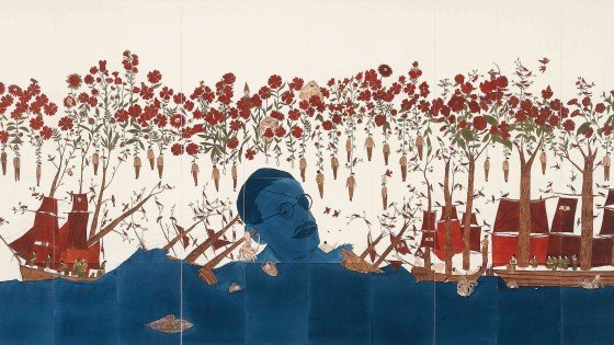
Anders Nilsen, Back cover illustration for Hans Christian Andersen’s “Fairy Tales.” (Penguin Books, 2006). Ink on paper.
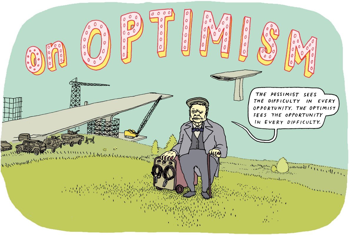
Anders Nilsen, “On Optimism.” (Why 2015 Won’t Suck, Medium Magazine)
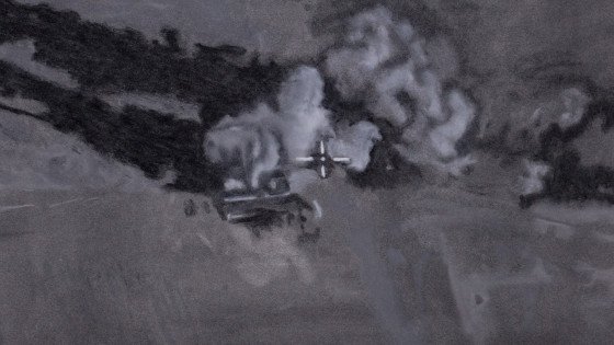
Unpublished illustration for Matter. 2014. Ink on paper with digital color.
Just that feeling of discovery, of how fun and compelling it could be allowed me to make some really good drawings…
L&M: When you got started with comics, did you feel immediately like I can do this, or was there a lot of doubt?
AN: I think I immediately felt like I can do this. There was a certain amount of pent-up enthusiasm for art making. It had been a while since I’d felt super excited about art marking. So once I put out Big Questions 1 & 2, it just felt super compelling and fun and #2 starts to point towards a larger story and I really hadn’t drawn like that since before undergrad. I mean I did the Two Headed Boy, so in a way I had been doing that a little bit. I guess growing up I was always the kid in class who was good at drawing or whatever. So I think I had a certain amount of confidence and even though I hadn’t been doing a lot descriptive drawing for a while it felt like it came naturally. It was great to suddenly feel like, oh my god this could be an actual story, this could be really fun and cool, people might be interested. I think some of the best drawing in Big Questions is in the 3rd issue, when I first started doing it. Just that feeling of discovery, of how fun and compelling it could be allowed me to make some really good drawings and then, you know, I got a little worried and wasn’t sure what I was doing for a while after that. Sophomore slump. But in general I think it came fairly naturally and I didn’t worry about it that much.
L&M: When you did The Ballad of the Two-Headed Boy, which was during art school, you were coming at that at as a painter, making one of your first comics. After that you did Big Questions 1 & 2. How did your drawing style evolve from art school onward, and how did you keep it consistent enough as your drawing improved in the 10 years it took to create Big Questions?
AN: I definitely got better at drawing, and I made a decision that that’s how I want to draw, which was sort of “clear-line.” In comics there’s a term, “clear-line” or “ligne claireligne claireLigne claire (French for clear line) is a style of drawing pioneered by Hergé, the Belgian creator of The Adventures of Tintin. It uses clear strong lines of uniform importance. Artists working in it do not use hatching, while contrast is downplayed as well. Cast shadows are often illuminated while a uniformity of line is used throughout, paying equal attention to every element depicted. Additionally, the style often features strong colours and a combination of cartoonish characters against a realistic background. All these elements together can result in giving strips drawn this way a flat aspect. The name was coined by Joost Swarte in 1977. (wiki).” Sort of generic. It’s not a super-idiosyncratic expressive style. It’s fairly straight forward. Kind of describing the world in the most simple, direct, realist way possible.
L&M: It is generic, but still recognizably you.
AN: Definitely, but in comparison to The Ballad of the Two Headed Boy for example which is kind of expressive and there’s more distortion happening.
L&M: You had said you didn’t like the expressive work in the The Ballad of the Two Headed Boy.
AN: Yeah.I would never want to draw like that again. (laughs) I have some affection for that book. It was fun and it was sort of a revelation in its own way at the time. It was one of the first things I did that felt like really me in some way, though it’s derivative in a lot of ways too. It pointed the direction to somewhere productive. But anyway, once I turned Big Questions into an actual comic, an actual story, in general the style was not the problem. But it was kind of deciding whether to make it really clean and careful vs. being a little rougher and sketchier and simpler. Issue 5 & 6 I kind of think of as the simple sketchy version.
L&M: I thought you mentioned that Issue #3 is where you started to make the better drawings.
AN: It took me a good year or two to be like, ok, yeah, actually I really want to draw cleanly, I want the drawings to be well rendered and beautiful and clean, and that partly because Big Questions grew out of my sketchbooks and in my sketchbooks it was really rough, and it had been very much about being off-the-cuff and stream of consciousness, and so once the drawing got cleaner and more involved, I wondered if it was going to become too precious. Later that just became less of an issue. I started doing more drawing in my sketchbook again and found other avenues for that kind of work. I felt like ok, Big Questions doesn’t have to be that. It can be it’s own thing.
L&M: Do you do normally draw really rough in your sketchbook and then redraw it better later?
AN: Not in my sketchbooks, no, but when I’m drawing comics I do, I mean now I do thumbnails which are very sketchy. Like this (shows thumbnails on cameraUntitled New Project ). Those are just thumbnails where I’m trying to lay down what information has to be in every panel.
L&M: Is that a page for Big Questions or something else?
AN: No, that’s for the book I’m working on now.
L&M: But there are birds in it.
AN: There’s an eagle. I can’t get away from the birds. (laughs)
L&M: So later you’ll go back and redraw these in pen and correct with white ink?
AN: No. From there I decide how many of those panels will fit on one page, and then I start drawing pages on a separate page.
L&M: How long does it take you approximately to do a page?
AN: When I was fully working on Big Questions, I would try to do a page a day. That’s all black and white. This new book is in color, so it’s probably gonna be a page every two days, and that’s a day where I set aside for drawing and let other work go. So in a week I would get 3 or 4, or if I was really lucky 5 pages done. Some of the underground scenes [in Big Questions], the scenes where they’re in the caves, those would end up taking two or three days just because there’s so much more detail and ink to lay down.
L&M: So this new color stuff, is it gouacheGouacheGouache, also spelled guache, is a type of paint in the category watermedia consisting of pigment, a binding agent (usually gum arabic), and sometimes added inert material, designed to be used in an opaque method. It also refers to paintings that use this opaque method. The name derives from the Italian guazzo. (wiki)?
AN: I’m sort of still figuring that out, but I think I have determined that it’s actually gonna get colored on the computer. I really meant to do it in gouache, but that would just make it insane. It would take too long and I don’t think I’d have enough control. Like I’d have to have some kind of crazy elaborate system of little jars of colors and stuff and it would make me bananas. (laughs)
[foogallery id=”6656″]
Anders Nilsen, “The Ballad of the Two Headed Boy.” (Self Published Undergrad Project)

Anders Nilsen, Early sketchbook drawings for “Big Questions.”
[foogallery id=”6667″]
Anders Nilsen, “Big Questions.” Issue #1.
[foogallery id=”6663″]
Anders Nilsen, Untitled New Project
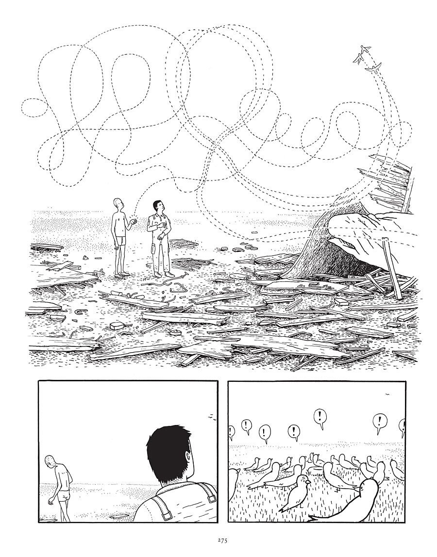
Anders Nilsen, “Big Questions.” (Drawn & Quarterly, 2011)
[foogallery id=”6744″]